Ours is a world dominated by mobile devices and on-the-go navigation, so the importance of mobile optimization has never been more relevant. Mobile optimization is the process of customizing your website so that it works seamlessly for visitors who access the site from mobile devices. While this may sound simple, it’s a little more complicated than you may think, and that’s why we’ve compiled some of the best strategies to deliver your users top-quality mobile experiences.
Why is Mobile Optimization Important?
Before we dive into the best practices and strategies for mobile optimization, it’s important to understand the importance of mobile optimization and the benefits that a robust mobile optimization strategy can bring to your business.
As mentioned, more and more users are browsing the web, buying online, and creating business relationships from their smartphones, tablets, and other mobile devices. Due to this continuous growth in popularity, businesses need to be able to guarantee their consumers an effortless mobile experience. This growth shows no signs of slowing down, and if anything, we are due to see further increases in mobile use in the coming years.
Benefits of Mobile Optimization
Optimizing your websites and landing pages for mobile doesn’t just keep your audience happy and returning to your pages, but there are several more benefits for your business. Let’s take a quick look at some of the major benefits before we reveal our top mobile optimization tips.
Google Loves Mobile-Optimized Sites
Google, the search engine behemoth, prioritizes mobile-friendly sites. In fact, mobile optimization is a major factor in Google’s search algorithm. Websites optimized for mobile will rank higher in mobile search results and benefit from the improved overall search rankings that this brings.
More Reach
Given the prevalence of mobile users, a mobile-friendly website will greatly expand your reach. Ignoring mobile optimization will result in you missing out on a significant portion of potential customers and visitors. With increasing numbers of users that operate exclusively on mobile, optimizing for mobile lets you tap into a much broader audience.
New Advertising Opportunities
Another valuable benefit of mobile is that it opens up new avenues for advertising. Sites that are optimized for mobile are able to seamlessly integrate location-based promotions, in-app ads, and other lucrative mobile advertising tactics. Leveraging these innovative advertising opportunities relies on your sites and pages being optimized for mobile.
Mobile Optimization Best Practices
Now that you are more familiar with the ins and outs of mobile optimization, let’s dive into our four key tips that will help you maximize your potential returns through mobile optimization.
1. Focus on Above-the-Fold Content
First and foremost, it is crucial to prioritize your above-the-fold content. This refers to the section of a webpage that is visible without scrolling and it is the section most likely to catch the user’s attention immediately. Make sure the most vital information, stunning visuals, and persuasive CTAs are displayed prominently above the fold to deliver a captivating first impression.
2. UI/UX and Design are Key
User Interface (UI) and User Experience (UX) are the heartbeat of mobile optimization. An intuitive design and an enjoyable experience combine to bring visitors a website that can be navigated easily on mobile devices. It’s important to implement responsive design principles, optimizing the layout for various resolutions and screen sizes.
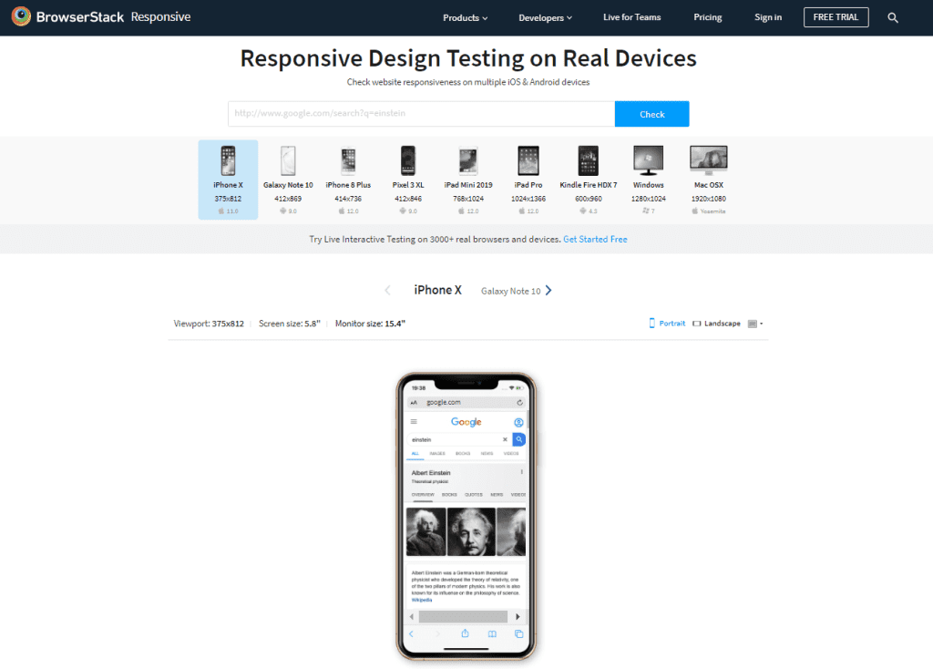
There are some fantastic tools available today that you can use to test and check the responsiveness of your design. BrowserStack is one such tool, and it allows you to verify your site’s mobile responsiveness from one device to another. Resources like this can be the difference between a truly responsive website and disappointment when you launch your new site on mobile.
3. Have a Custom CMS for Mobile
Our next tip is to consider utilizing a custom Content Management System (CMS) that’s specifically designed for mobile use. This approach will help you tailor your content for mobile users, offering them an efficient and streamlined experience. A customized CMS for mobile allows for faster load times, one of the most important factors in retaining mobile users.
4. Optimize Images and Multimedia
Finally, you must optimize your images and multimedia elements to reduce page load times. Mobile users crave speedy navigation, and this optimization process will improve the user experience significantly. On top of this, it will positively impact your site’s search engine rankings.
Pro Tip
Focus on Above-the-Fold content, design, a custom CMS, and having the best images or videos for a flawless user mobile experience.
Optimize for Mobile with inSegment
As we’ve seen, we are living in a mobile-first era, so it’s only natural that mobile optimization has emerged as a necessary element of a successful online presence. By following our helpful tips laid out above, you will be able to drive more traffic to your pages and keep users there for longer, nudging them ever-closer to conversion. Setting up a comprehensive mobile optimization strategy, however, can be a daunting task.
When you need help getting started, turn to inSegment, Boston’s leading digital marketing agency with a dedicated team of mobile marketing and optimization experts. inSegment’s team boasts years of experience crafting and maintaining mobile optimization strategies for dozens of clients across multiple industries, so you can count on the team having experience relevant to your niche.
Reach out to inSegment today and get started on optimizing your landing pages and websites for mobile.